
Business
Feature Properties
Hong Kong Properties
Mainland Properties
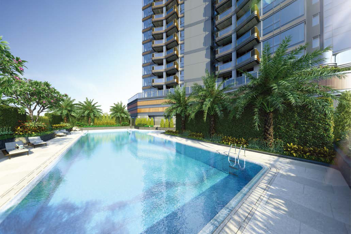
The photographs, images, drawings or sketches shown in this advertisement/promotional material represent an artist’s impression of the development concerned only. They are not drawn to scale and/or may have been edited and processed with computerized imaging techniques. Prospective purchasers should make reference to the sales brochure for details of the development. The vendor also advises prospective purchasers to conduct an on-site visit for a better understanding of the development site, its surrounding environment and the public facilities nearby. This advertisement is published by the vendor or with the consent of the vendor. Please refer to the sales brochure for details.